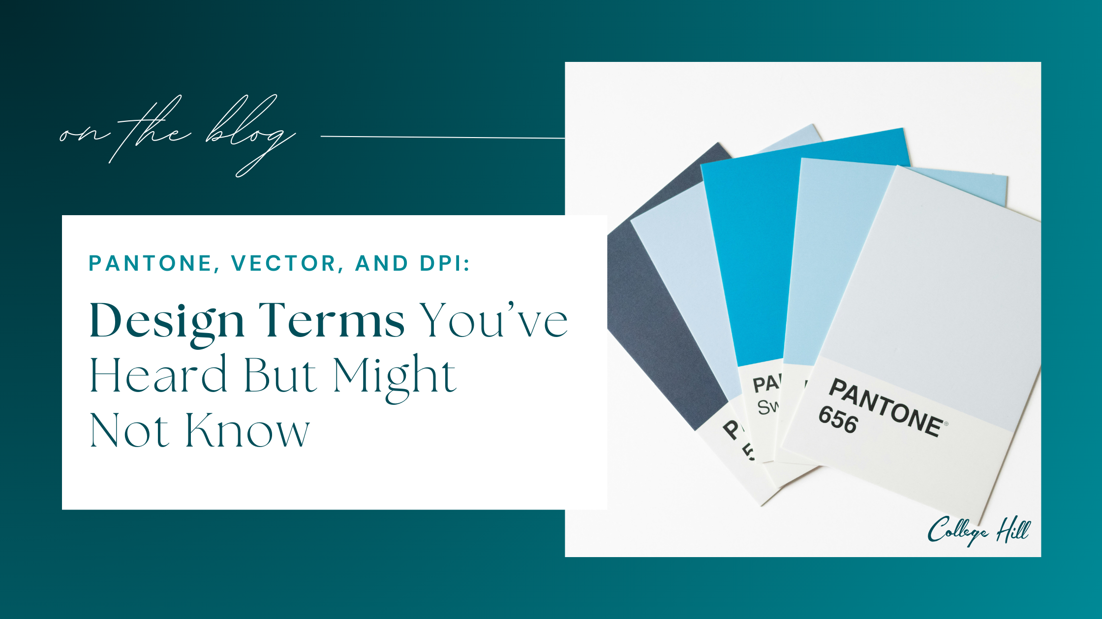
When working on apparel, merchandise, or design kits, you've probably run into terms like Pantone, Vector, or DPI. They're simple once you know them! But confusing enough to slow a project down or lead to unexpected results.
At College Hill, we use these terms everyday. So here's a quick, friendly guide to help you feel more confident the next time they come up!
Pantone: The Secret to Getting "Your Blue" Every Time
Colors look different on every screen and printer. Pantone is the universal language designers use to make sure everyone is talking about the same color. No guessing, no "this looks too teal," and no garments coming out as a totally different color.
Why does this matter for your project?
-
Your brand colors stay consistent across apparel, merchandise, signage, and digital mockups
- Multiple vendors can match the exact same shade
- The design process runs smoother
Think of Pantone as the GPS coordinates for your brand color - precise, reliable, and repeatable!
.jpg?width=807&height=538&name=Pantone%20Swatches%20(1).jpg)
Vector Files: The Artwork That Stays Sharp Forever!
A vector file (think AI, EPS, SVG) is your design's master file. Instead of being made of pixels, it's made of paths. Meaning it can scale from a teeny tiny lapel pin to a 20-foot banner without getting blurry or pixilated.
Why designers LOVE vectors:
-
They're clean, flexible, and editable
- Perfect for embroidery, screen printing, engraving, and large-scale prints
- They ensure your logo looks crisp, not fuzzy or pixelated
If we ask for a vector file, it's simply because it helps us produce the best possible result!
![]()
DPI: The Quiet Setting That Makes Your Prints Look Good
DPI (Dots Per Inch) tells us how much detail is in your image. It's one of those invisible specs that can make the difference between "Wow, this looks great!" and "Why does this look blurry?"
-
300 DPI is ideal for apparel prints, stickers, or posters
- 150 DPI works for large banners, viewed from far away
- 72 DPI is great for websites, not great for printing
If we say a file is "too low-res," it usually just means that the DPI is too small for the size you're printing!
Let's Make This Easy!
You don't need to be a designer to understand these basics, nor do you need to know it all. That's why our team of experts is here to help! Just knowing a little about Pantone, Vector, and DPI makes the whole creative process smoother and helps ensure the final product looks exactly the way you pictured it.
Here is a little cheat sheet we created to help - feel free to download it!
.png?width=736&height=920&name=Pantone%2c%20Vector%2c%20and%20DPI%20CHEAT%20SHEET%20(1).png)
If you're ever feeling a little lost, or have questions about artwork files and how to prep something for print, we're here to help!
Contact us today to begin working with our team of experts:

Leave a Reply